In 2017, at SDL we decided to take a closer look at our B2B and B2C solutions for the translation supply market. We had an ecosystem of 6 SaaS products that integrated together, each addressing several customer profiles or groups. Here's how the interaction looked like:
We already knew (see Customer benefit) that we wanted to focus on two key customer profiles, the Professional Translator and the Project Manager. In order to be able to spot and prioritize key problems, I was tasked to run our first extended usability research across the ecosystem.
If you're planning to run such an initiative, I recommend you first start by a survey that will allow you to do map key responsibilities, interactions and tools. This will give you ideas of where you'll need to focus your attention and a basis for a more in-depth study with selected participants.
Our survey was designed to help us learn:
:: What are their responsibilities?
:: When are they successful?
:: Who do they collaborate with?
:: What are their significant tasks?
Frequency, difficulty, importance and tools.
Frequency, difficulty, importance and tools.
The next step was to organize a Usability Testing Lab and observe the most most frequent, painful and important tasks in their normal context, as the users carry them out. So if you're planning such an initiative, what's key here is to invite a diverse team as note-takers, especially developers. This will ensure that the issues will actually be fixed because the people that you invite as observers and note-takers will empathize and thus take ownership.

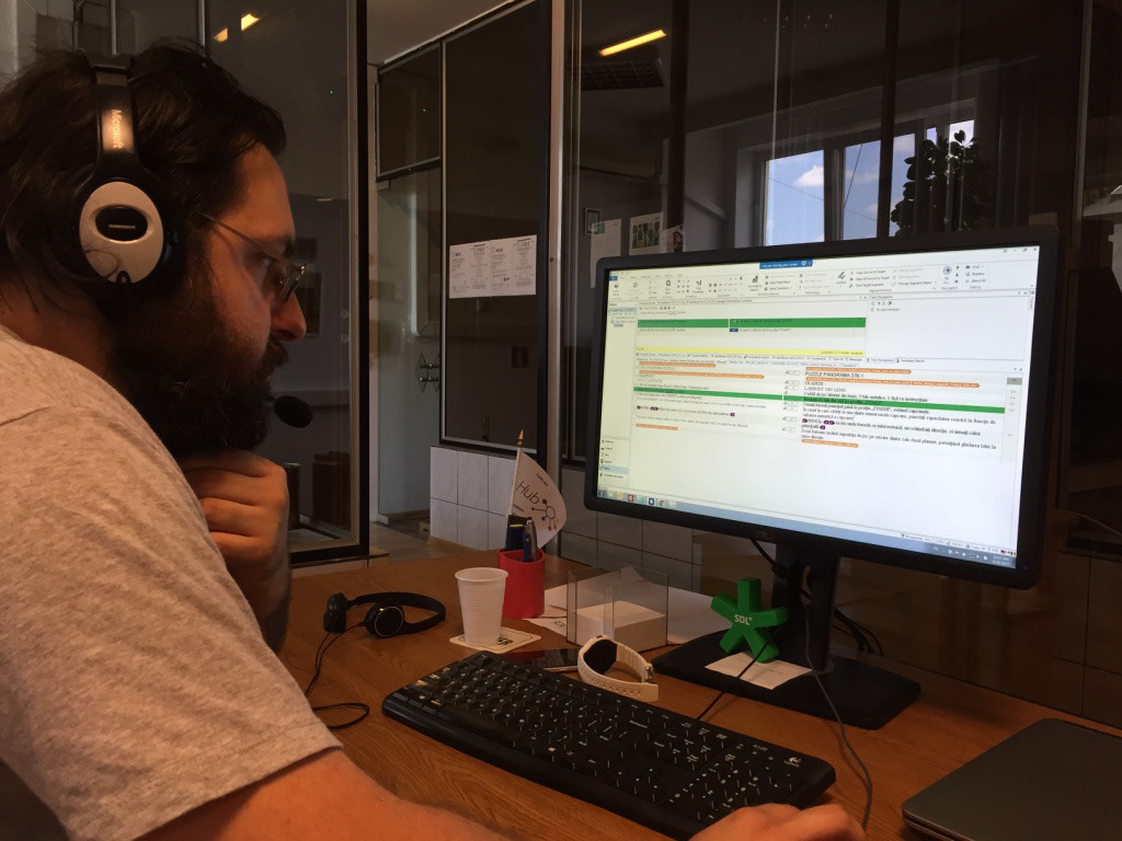
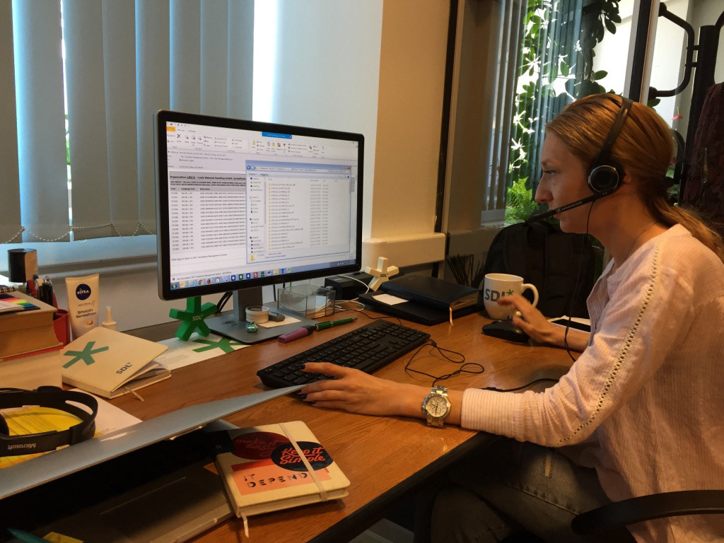

We observed 32 users, on 3 continents (Europe, North America, Asia) and spend at least 1h with each of them, in-person or remote. I collected 31h 45min of video footage, involved 16 note-takers among developers, testers, product managers, product owners, other designers, and even VPs.
The result was a list of 80 unique issues (actual or perceived usability), across 10 tasks and 8 products. I grouped the issues into 4 themes to help product management with prioritization.
But how can one decide what is more important across such a list? How to extract meaningful insights that would lead to a vision that we could explore for the future? We noticed that the main pains were related to project preparation.
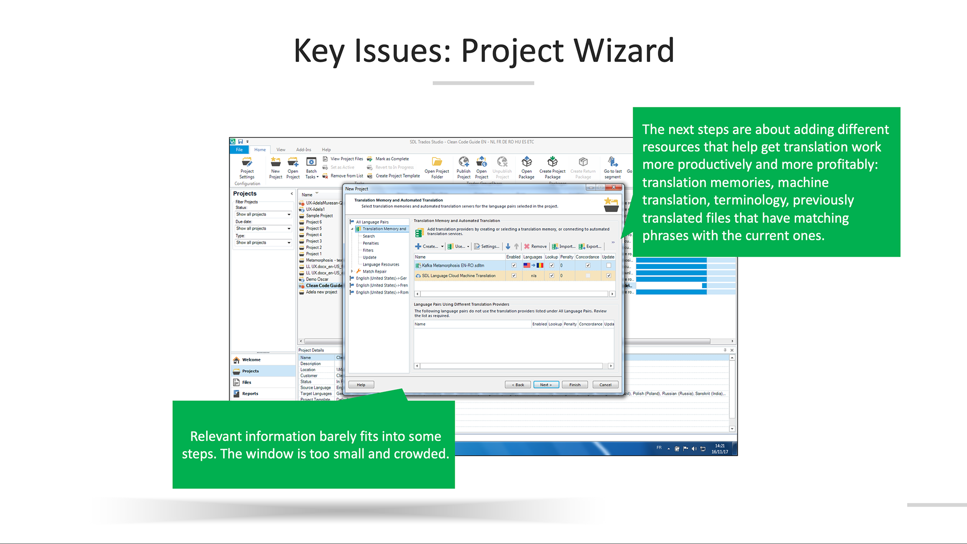
To address that, we redesigned our project creation wizard in our star-ship product. Trados Studio was a complex desktop product, available on Windows only. Several constraints impacted the design: firstly the UI needed to be consistent with MS Office, then two different tech component systems were being used (Infragistics and WinForms) and there was quite some legacy code. My concept proposed a faster, more predictable approach because it automated most steps in a complex flow and all users needed to do was available in the first step!
FROM




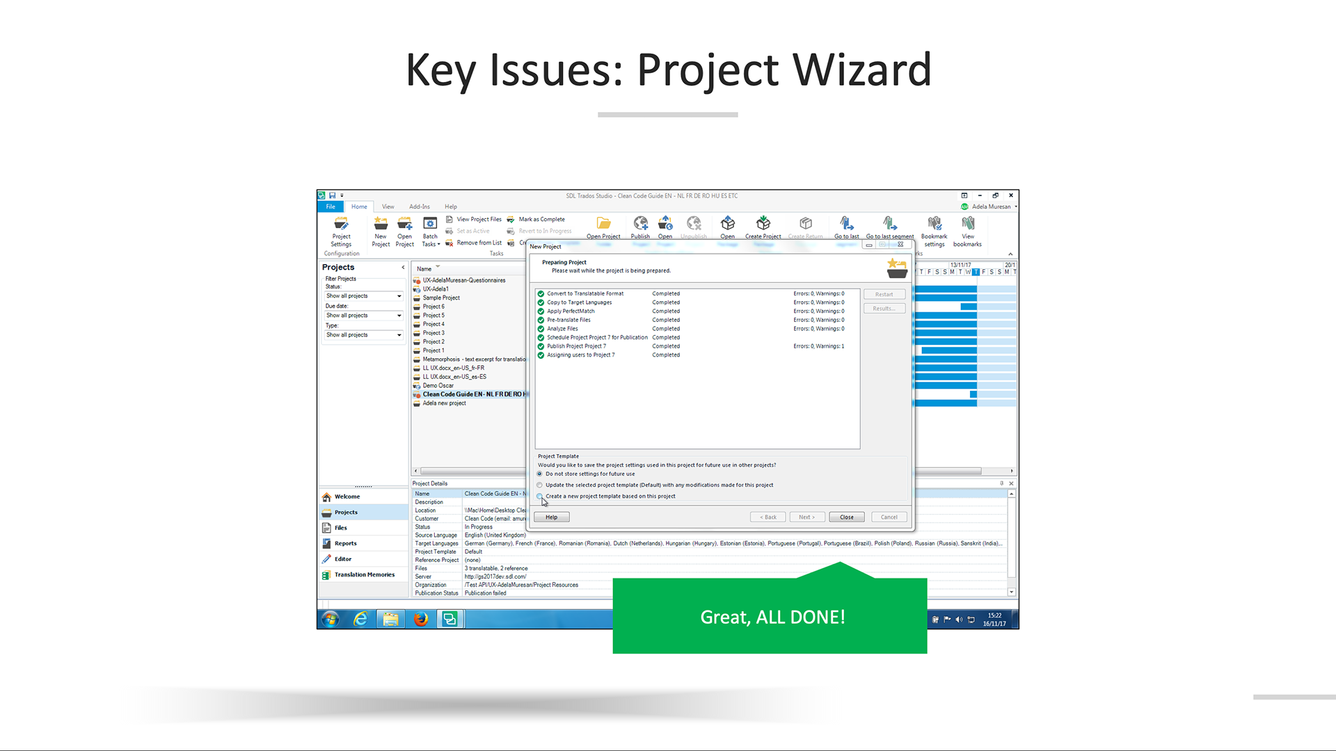
TO
The concept prototypes did extremely well in user tests (which also helped correct some minor details) and, in the first month after the new wizard was released in the summer of 2018, the usage had already increased by 10%. The design team cascaded those changes throughout the ecosystem in our cloud-based tools (Trados Groupshare, Translation Toolkit) to give users a consistent experience during this meaningful moment.
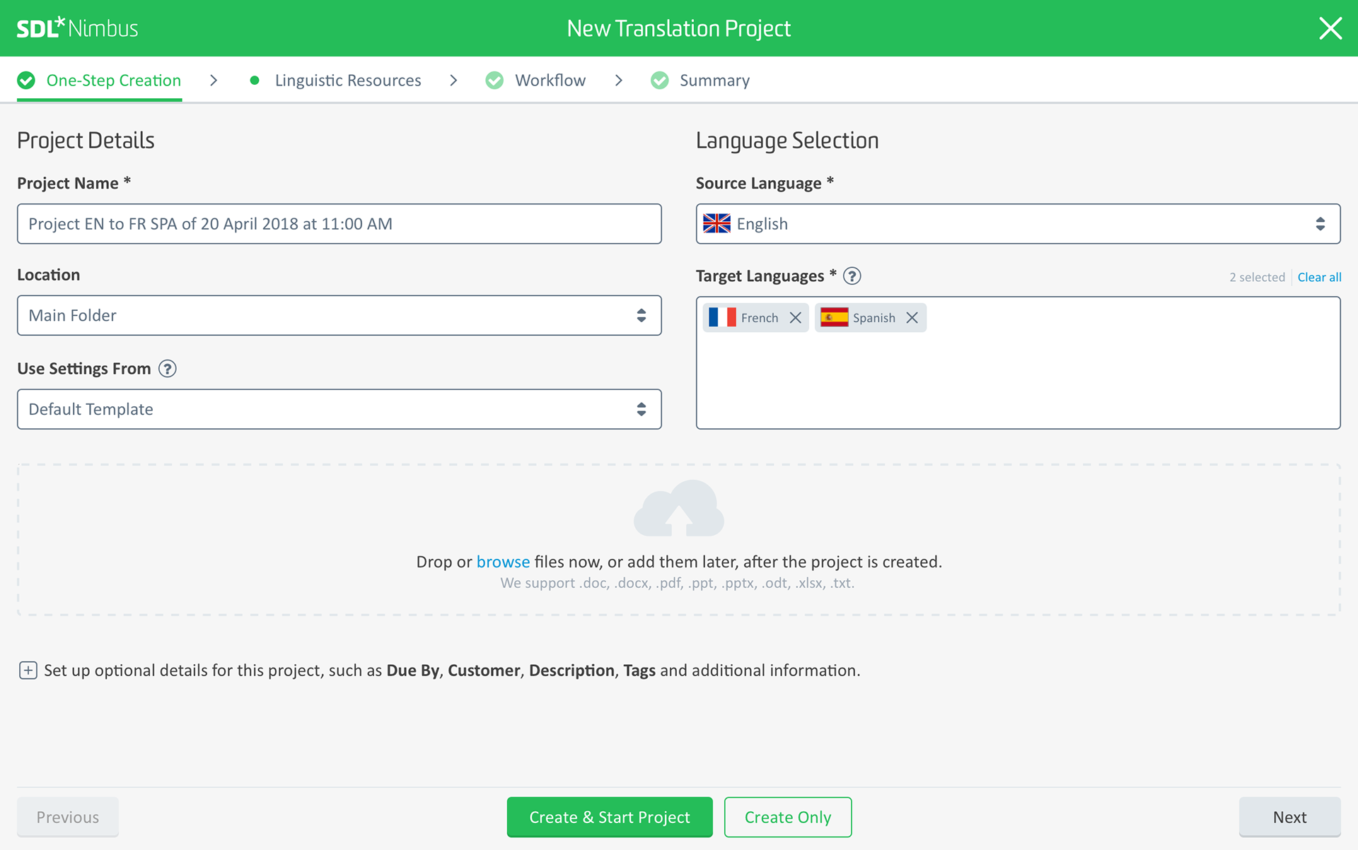
- -
A second area that we explored concepts for was QA checks - a painful task carried out by translators daily to ensure the quality of their translation.
But more than just concrete features that we could improve, what what the research had showed us about the system was how it could be evolved. Together with the design team we started working on the new idea of convergence through an AI-based platform and personalized experiences (see Inspiring concepts).
